Tracking a responsive site and the media queries changes
Every day more sites choose to use a responsive designs for their new sites, making it somekind difficult to track what version of our page is being showed to the user (as all we may now, browser detection is not perfect at all, most of them are based on the User Agent that can be easily faked).
This post will try to show you the different ways to track if user's are viewing a responsive layout or not, and using the Google Analytics Event Tracking to even track the layout changes if the browser window is resized by the user.
New browsers allow you to query the current @media actually being used on the page using the matchMedia API though not all browsers have access to this API. The responsive designs work setting some new css's rules based on the current page viewPort of the browser, this is; the usable width and height within the current browser window.
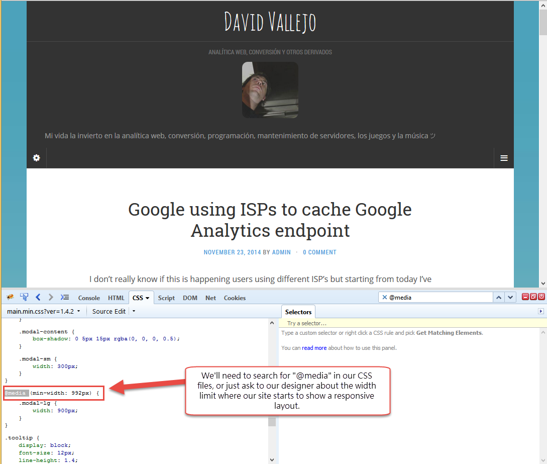
As each site may have their own defined width limits to switch to a new layout, we'll need to check out CSS files to find which one we'll be using to detect if the user is viewing a different responsive layout but the desktop one.
It may happen that our site has more than one @media's defined to make the site fully compatible with some specific devices ( ipad1, ipad2, etc ). If this is our case I recomend just to check for the main @media that really makes the difference, or if you want to go further you could even improve the current post examples to track every single available layour within your site.
var matchMedia = window.matchMedia || window.msMatchMedia; var customVarResponsive; if(window.matchMedia) window.matchMedia("(max-width: 992px)").matches ? customVarResponsive='yes' : customVarResponsive='no'; else customVarResponsive = 'no'; ga('set','dimensionXX',customVarResponsive);
As we've mentioned before not all browsers does support the mediaMatch API (You can check browsers support in the table below), so there's some other more standard method to get this info, and instead of matching the current used @media, we'll need to check the current viewPort width size againts the max-width defined in our CSS file:
The following snippet will let you track the current browser's viewPort and it's fully compatible with all the browsers:
if((Math.max(document.documentElement.clientWidth, window.innerWidth || 0))>=992)
  var customVarResponsive = "no";
else
  var customVarResponsive = "yes";
ga('set','dimensionXX',customVarResponsive);
In any case using the matchMedia API is fancier way to achieve this, and is widely supported plus it give us more flexibility for example allowing us to use a listener to monitor the @media changes without needing to query the current viewPort size every X seconds, and why not sending an event if the user's layout changed after the initial page load :)
<script>
// IE msMatchMedia var matchMedia = window.matchMedia || window.msMatchMedia; function getMaxWidth (mq) { if(mq.matches) // We do not want to send an interactive event ga('send','Responsive Tracking','Went Responsive',null.null,true); else ga('send','Responsive Tracking','Went Desktop',null.null,true); } if(matchMedia) responsiveCheck = window.matchMedia("(max-width: 992px)"); responsiveCheck.addListener(getMaxWidth);
</script>
There we have it, everytime the current user @media's changes, a new event will be send to Google Analytics using the Event Tracking, or this can be extended to be user with any other tracking tool with not much efforts but calling our analytics tool method to do the event tracking, or setting the custom dimensions.
Of couse this would allow us to have a different tracking for our sites, as we could define different event's for each of our layouts.

